I have written this into my bengali ebook on julius at কাস্টমারদের ডাটাসেট | ডাটা নিয়ে কথা - প্রথম সংস্করণ
So lets talk about a small portion of this dataset which is a real life customer transaction dataset . First lets see the data heads :
These are question I looked for while doing the analysis of this data set :
So lets talk about the customers purchase habit by lcoation how julius visualise this :
- The left side of the chart lists regions: West, South, Region (which likely refers to a specific region of the country), North, and East.
The right side of the chart lists two ways customers can buy: Email and Web.
Each box in the center of the chart shows the number of customers who purchased by location and how they purchased. For example, the box in the first row and first column shows that 24 customers in the east purchased through Email.
So with the help of company website people from west region has bought most . From east region people mostly placed order using company website.
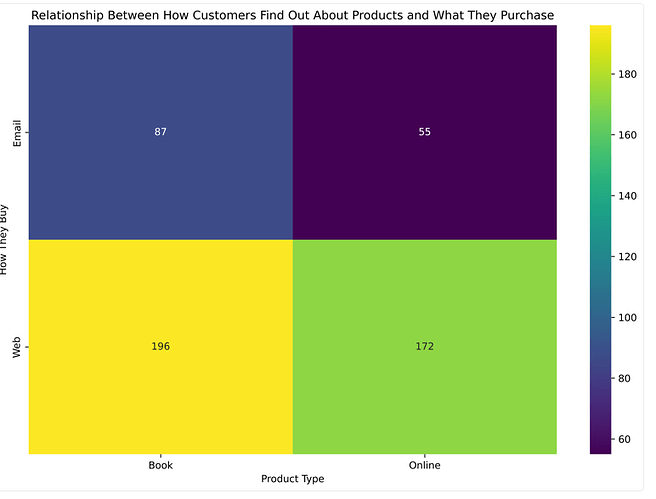
Now lets find a relationship between how customers find out the product and what products they purchase. Check this mapping :
There are 2 types of products. Book and online product. So from email customers mostly preferred to buy from company website.
The way julius visualzied it , is amazing.


